
Case Study

Case Study

GRT mobile experience redesign

GRT mobile experience redesign

Oak Bank:

Designing trust,

clarity, and

financial visibility.

Oak Bank:

Designing trust, clarity, and financial visibility.

Oak Bank: Designing trust, clarity, and financial visibility.

A complete concept design for a modern mobile banking app focused on making account balances, credit health, and savings progress instantly readable, with a premium dark interface that feels approachable in daily use.

A complete concept design for a modern mobile banking app focused on making account balances, credit health, and savings progress instantly readable, with a premium dark interface that feels approachable in daily use.

Role: UX/UI Designer

Role: UX/UI Designer

Type: Concept Design

Type: Concept Design

Tools: Figma

Tools: Figma

Timeline: 8 Weeks

Timeline: 8 Weeks

Platform: Mobile Banking App

Platform: Mobile Banking App

View Prototype

View Prototype

Read Process

Read Process

BACKGROUND

BACKGROUND

A fictional bank built to solve real problems.

A fictional bank built to solve real problems.

A fictional bank built to solve real problems.

Oak Bank's tagline, Cultivate your Wealth, Nurture your Future — shaped every design decision from the splash screen to the investment portfolio.

Oak Bank's tagline, Cultivate your Wealth, Nurture your Future — shaped every design decision from the splash screen to the investment portfolio.

What is Oak Bank?

Oak Bank is a fictional mobile banking concept created to explore what a
modern, trust-first digital finance experience could look like. In an era
dominated by digital transformation, the project pushes the boundaries of
what's possible — combining everyday banking with investment access,
personalised goals, and a support experience that feels human.

Oak Bank is a fictional mobile banking concept created to explore what a modern, trust-first digital finance experience could look like. In an era dominated by digital transformation, the project pushes the boundaries of what's possible, combining everyday banking with investment access, personalised goals, and a support experience that feels human.

Oak Bank is a fictional mobile banking concept created to explore what a
modern, trust-first digital finance experience could look like. In an era
dominated by digital transformation, the project pushes the boundaries of
what's possible — combining everyday banking with investment access,
personalised goals, and a support experience that feels human.

Why it exists

The Oak Bank mobile app transforms traditional banking into a dynamic
and personalised experience. Users can effortlessly manage accounts,
conduct secure transactions, and explore diverse investment avenues —
including the world of cryptocurrencies — all from a single, coherent
interface designed around how people actually use money day to day.

The Oak Bank mobile app transforms traditional banking into a dynamic and personalised experience. Users can effortlessly manage accounts, conduct secure transactions, and explore diverse investment avenues, including the world of cryptocurrencies, all from a single, coherent interface designed around how people actually use money day to day.

The Oak Bank mobile app transforms traditional banking into a dynamic
and personalised experience. Users can effortlessly manage accounts,
conduct secure transactions, and explore diverse investment avenues —
including the world of cryptocurrencies — all from a single, coherent
interface designed around how people actually use money day to day.

The Problem

The Problem

Traditional banking creates friction at the moments users need clarity most.

Traditional banking creates friction at the moments users need clarity most.

Traditional banking creates friction at the moments users need clarity most.

Users checking balances, reviewing credit, or making transfers need immediate clarity. Existing apps often require too many steps to reach critical data, with inconsistent layouts that erode trust rather than build it.

Users checking balances, reviewing credit, or making transfers need immediate clarity. Existing apps often require too many steps to reach critical data, with inconsistent layouts that erode trust rather than build it.

01

Complex interfaces

Users struggle with traditional banking interfaces, making it challenging to manage accounts efficiently.

Users struggle with traditional banking interfaces, making it challenging to manage accounts efficiently.

02

Limited investment options

Users find themselves constrained by limited investment opportunities offered by conventional platforms.

Users find themselves constrained by limited investment opportunities offered by conventional platforms.

03

No personalisation

Traditional banks offer a one-size-fits-all approach, neglecting the need for personalised financial experiences.

Traditional banks offer a one-size-fits-all approach, neglecting the need for personalised financial experiences.

04

Outdated support

Users face frustration with slow, impersonal support systems that lack assistance in critical moments.

Users face frustration with slow, impersonal support systems that lack assistance in critical moments.

05

Inconsistent support quality

Variable quality leads to unpredictable experiences depending on the nature and urgency of user queries.

Variable quality leads to unpredictable experiences depending on the nature and urgency of user queries.

06

Security concerns

Users express concerns about financial data vulnerability due to inadequate security in traditional platforms.

Users express concerns about financial data vulnerability due to inadequate security in traditional platforms.

Design Process

Design Process

A premium experience that never sacrifices speed or confidence.

A premium experience that never sacrifices speed or confidence.

A premium experience that never sacrifices speed or confidence.

Four pillars guided every layout and interaction decision, from information hierarchy to navigation depth to visual consistency across screens.

Four pillars guided every layout and interaction decision, from information hierarchy to navigation depth to visual consistency across screens.

01

Clarity- first hierarchy

Financial information ordered by importance balances, credit, and

account states understood in seconds.

Financial information ordered by importance balances, credit, and account states understood in seconds.

02

Fast daily interactions

Primary tasks like checking balances and transferring funds reachable with minimal navigation depth.

03

Trust through predictability

Consistent navigation, grouping, and feedback patterns make the experience stable and dependable.

04

Premium but usable

Polished visual design balanced with disciplined spacing, contrast, and recognisable banking patterns.

LOW FIDELITY

LOW FIDELITY

Low-fidelity exploration before visual polish.

Low-fidelity exploration before visual polish.

Low-fidelity exploration before visual polish.

Before committing to any visual direction, wireframes mapped out task structure, content hierarchy, and key user flows, focussing on what goes where, not how it looks.

Before committing to any visual direction, wireframes mapped out task structure, content hierarchy, and key user flows, focussing on what goes where, not how it looks.

DIagram

Diagram

Design Goals

Design Goals

What the redesign needed to achieve.

What the redesign needed to achieve.

What the redesign needed to achieve.

Surface account balances and credit status without requiring

deep navigation.

Surface account balances and credit status without requiring deep navigation.

Surface account balances and credit status without requiring deep navigation.

Make savings progress visible alongside daily account monitoring.

Make savings progress visible alongside daily account monitoring.

Reduce steps to reach support and high-urgency actions.

Reduce steps to reach support and high-urgency actions.

Build a consistent UI system that feels premium across every screen.

Build a consistent UI system that feels premium across every screen.

Design Principles

Design Principles

Simple rules that guided every screen.

Simple rules that guided every screen.

Simple rules that guided every screen.

01

Clarity first

Users understand their financial position with one quick scan, without mental calculation.

02

Reduce friction

Patterns, icons, and layouts feel familiar so users never have to

relearn core tasks.

Patterns, icons, and layouts feel familiar so users never have to relearn core tasks.

03

Consistent system

Frequent tasks reachable quickly, especially during high-stress

financial moments.

Frequent tasks reachable quickly, especially during high-stress financial moments.

User Personas

Understanding who we're designing for.

Understanding who we're designing for.

Understanding who we're designing for.

Two distinct personas shaped every design decision — from information hierarchy to investment feature depth.

Two distinct personas shaped every design decision — from information hierarchy to investment feature depth.

EA

EA

Daily banking user

Daily banking user

Emily Anderson-Smith

Emily Anderson-Smith

Age 30

Age 30

Busy schedule

Busy schedule

Software Developer

Software Developer

Tech-savvy

Tech-savvy

"I need a banking app that keeps up with my life, fast account views, quick transfers, and financial goals I can actually track."

"I need a banking app that keeps up with my life, fast account views, quick transfers, and financial goals I can actually track."

Core Needs

Seamless account management on mobile

Seamless account management on mobile

Quick money transfers with minimal steps

Quick money transfers with minimal steps

Advanced investment options

Advanced investment options

Personalised financial goal tracking

Personalised financial goal tracking

Frustrations

Traditional banking feels cumbersome

Traditional banking feels cumbersome

Too many taps to reach key information

Too many taps to reach key information

No visibility into savings progress

No visibility into savings progress

AR

AR

Occasional investor

Occasional investor

Alex Rodriguez-Miller

Alex Rodriguez-Miller

Age 28

Age 28

Investment-minded

Investment-minded

Marketing Analyst

Marketing Analyst

Curious

Curious

"When I use a banking app, I need the experience to feel obvious right away, especially when I'm trying to understand investments."

"When I use a banking app, I need the experience to feel obvious right away ,especially when I'm trying to understand investments."

Core Needs

Easy access to diverse investment options

Easy access to diverse investment options

User-friendly interface for crypto & stocks

User-friendly interface for crypto & stocks

Educational resources for financial decisions

Educational resources for financial decisions

Simple top-up and card management

Simple top-up and card management

Frustrations

Traditional platforms limit investment options

Traditional platforms limit investment options

Complex navigation kills confidence

Complex navigation kills confidence

Weak visual hierarchy on key screens

Weak visual hierarchy on key screens

Competitive Research

Learning from established banking products.

Learning from established banking products.

Learning from established banking products.

Heuristic review

UX audit

Interface analysis

RBC

RBC

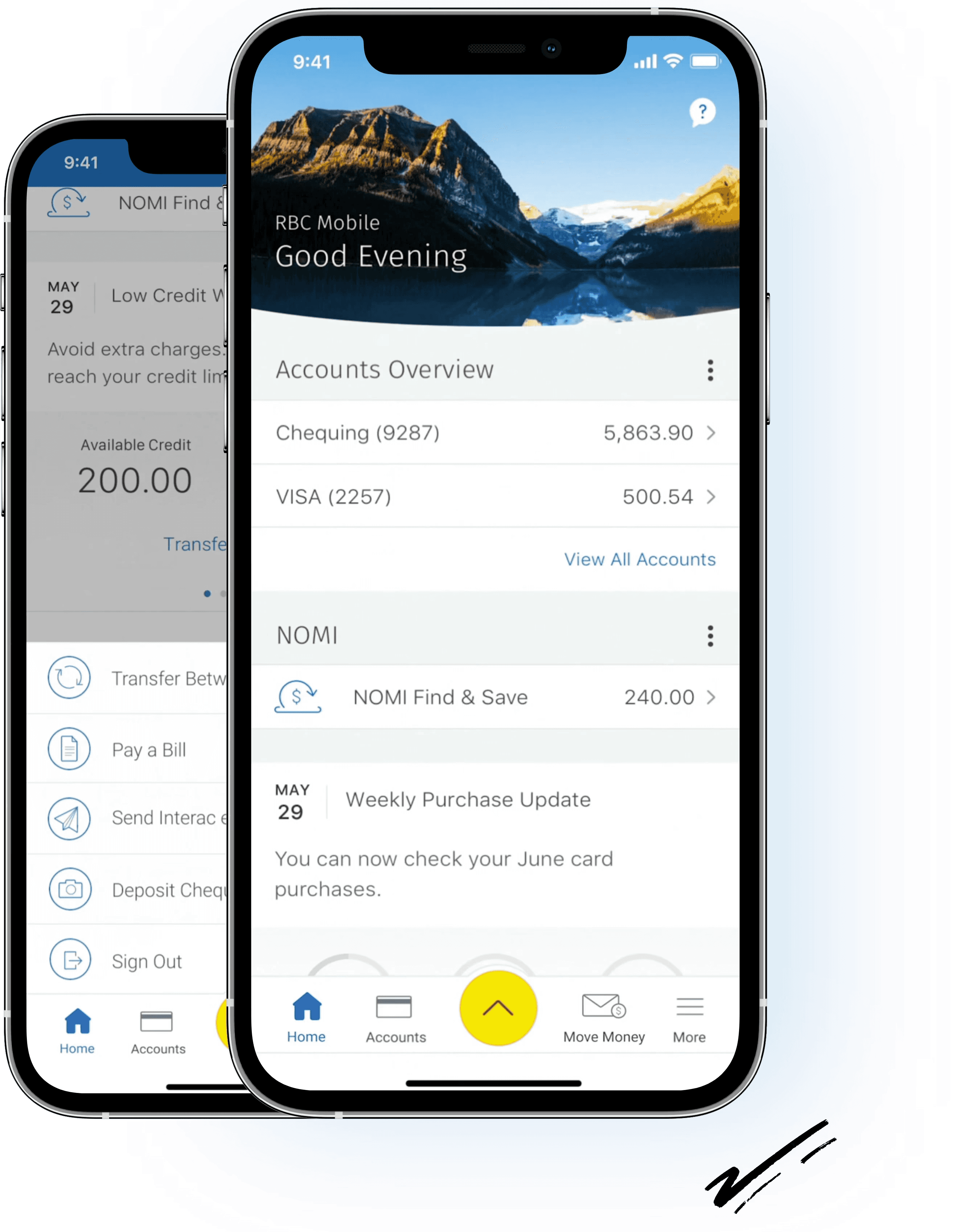
RBC employs bottom navigation with card-style layouts ensuring easy access to account summaries and transaction histories. The minimalist approach emphasises essential features and robust security, though accessibility features like scalable fonts and voice-over compatibility have room to improve.

RBC employs bottom navigation with card-style layouts ensuring easy access to account summaries and transaction histories. The minimalist approach emphasises essential features and robust security, though accessibility features like scalable fonts and voice-over compatibility have room to improve.

Strengths

Strengths

Clear visibility and interactive home screen elements

Clear visibility and interactive home screen elements

Consistent layout and logical organisation

Consistent layout and logical organisation

Strong focus on user-friendly design

Strong focus on user-friendly design

Gaps

Gaps

Limited accessibility — scalable fonts and

voice-over

Limited accessibility — scalable fonts and voice-over

Limited accessibility — scalable fonts and voice-over

Credit card usage information lacks visual clarity

Credit card usage information lacks visual clarity

Credit card usage information lacks visual clarity

Oak Bank Opportunity

Oak Bank Opportunity

Stronger cross-screen consistency with credit health and support access more visible by default, plus improved accessibility foundations.

Stronger cross-screen consistency with credit health and support access more visible by default, plus improved accessibility foundations.

Scotiabank

Scotiabank

Scotia Bank's app uses a vibrant red and white brand identity with bottom navigation and card- style layouts. It prioritises visibility for account summaries and transactions but faces shortcomings around accessibility and user comprehension of credit information.

Scotia Bank's app uses a vibrant red and white brand identity with bottom navigation and card- style layouts. It prioritises visibility for account summaries and transactions but faces shortcomings around accessibility and user comprehension of credit information.

Strengths

Strengths

Visually engaging interface with clear navigation

Visually engaging interface with clear navigation

Robust authentication and comprehensive user assistance

Robust authentication and comprehensive user assistance

Familiar banking structure users recognise

Familiar banking structure users recognise

Gaps

Gaps

Absence of font size adjustment and voice-over compatibility

Absence of font size adjustment and voice-over compatibility

Credit card usage and limits are hard to understand

Credit card usage and limits are hard to understand

Dense visual groupings slow scanning speed

Dense visual groupings slow scanning speed

Oak Bank Opportunity

Oak Bank Opportunity

Simpler financial grouping, a visual credit progress indicator, and a cleaner modern hierarchy that reduces cognitive load.

Simpler financial grouping, a visual credit progress indicator, and a cleaner modern hierarchy that reduces cognitive load.

Oak Bank Direction

Oak Bank Direction

Oak Bank addresses the gaps found across both competitors — surfacing credit status visually, making support instantly reachable, and offering investment access (including crypto) within a premium, consistent dark interface.

Oak Bank addresses the gaps found across both competitors — surfacing credit status visually, making support instantly reachable, and offering investment access (including crypto) within a premium, consistent dark interface.

Differentiators

Differentiators

Premium dark surfaces with card-based visual

Premium dark surfaces with card-based visual

grouping

grouping

Visual credit usage indicator on the dashboard

Visual credit usage indicator on the dashboard

Savings progress visible from the home screen

Savings progress visible from the home screen

Conversational support built into the core flow

Conversational support built into the core flow

Acknowledged Gaps

Acknowledged Gaps

Needs real-world usability validation

Needs real-world usability validation

Accessibility testing can be expanded further

Accessibility testing can be expanded further

Positioning

Positioning

Fast scanning, transparent financial visibility, and a cleaner modern experience that feels built for today's mobile-first users.

Fast scanning, transparent financial visibility, and a cleaner modern experience that feels built for today's mobile-first users.

SOLUTION

SOLUTION

What Oak Bank built to fix these problems.

What Oak Bank built to fix these problems.

What Oak Bank built to fix these problems.

Each solution maps directly to a problem identified through research and usability testing.

Each solution maps directly to a problem identified through research and usability testing.

01

Streamlined account management

A user-friendly interface that puts total balance, account breakdown, and quick actions on a single home screen, so everyday tasks take seconds, not minutes.

02

Diverse investment access

A dedicated Invest tab gives users access to stocks and cryptocurrency alongside everyday banking , broadening financial growth options without leaving the app.

03

Intuitive investment tools

Portfolio views, time-range charts, and clear deposit/withdraw flows cater to users at every level of financial expertise, from first-time investors to experienced traders.

04

Human support experience

A conversational chat interface with a named advisor (Andrew) replaces ticket forms and FAQ pages, making support feel like a dialogue rather than a search problem.

05

Personalised financial goals

Named savings goals with progress bars, Alberta Trip, Wedding Anniversary, Mortgage, make long-term saving feel tangible and motivating rather than abstract.

06

Trust through visual clarity

A consistent dark surface, card-based grouping, and progress indicators replace text- heavy layouts, so users feel in control of their finances at every glance.

Onboarding flow

Onboarding flow

First impressions that build confidence.

First impressions that build confidence.

First impressions that build confidence.

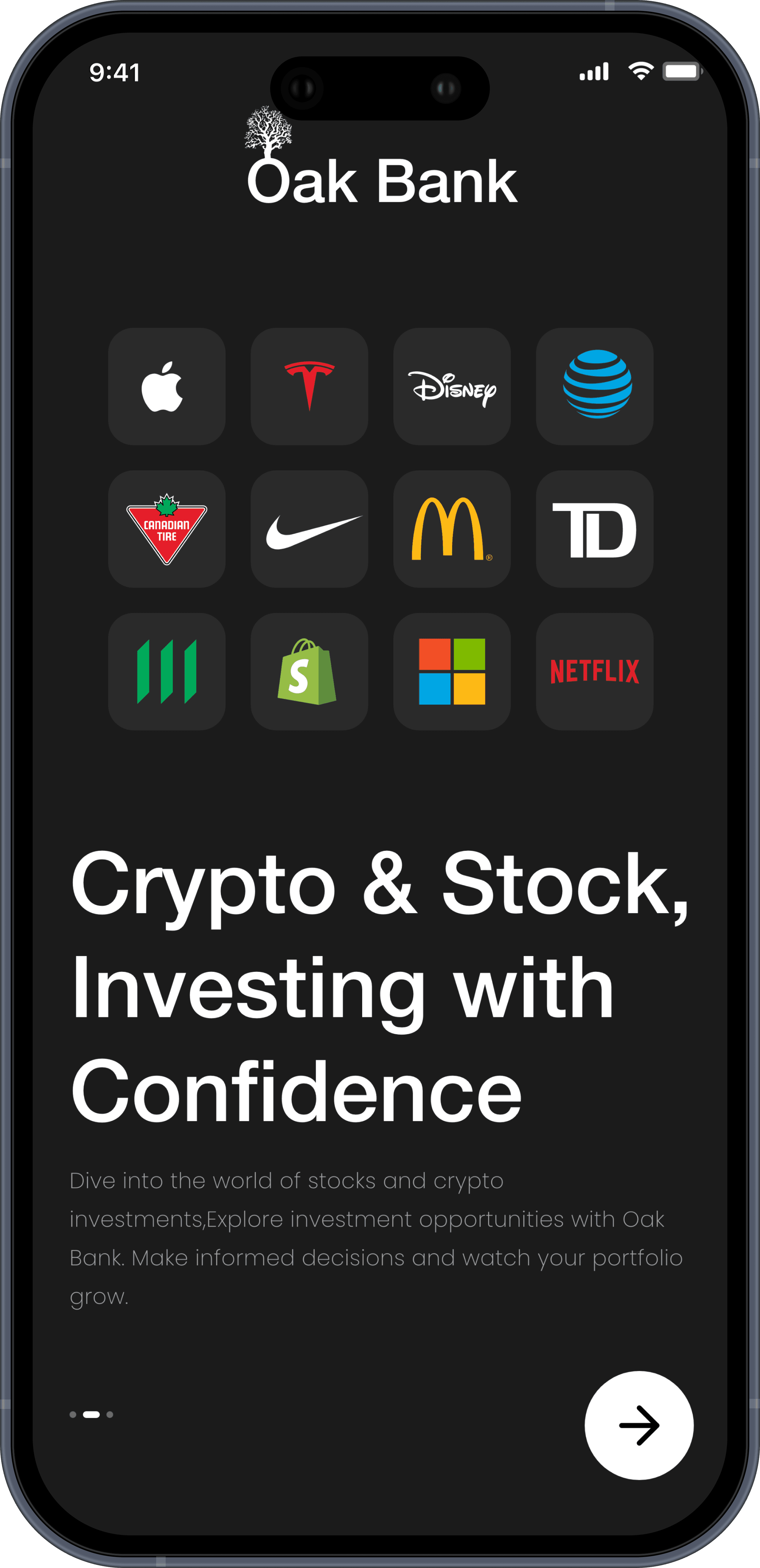
The onboarding sequence introduces Oak Bank's value props — trust, investment, and community, before asking the user for anything.

The onboarding sequence introduces Oak Bank's value props — trust, investment, and community, before asking the user for anything.

Splash

SCREEN 1

Brand Identity

Oak tree logo and tagline, sets tone before any action is required.

Oak tree logo and tagline, sets tone before any action is required.

Natural Wealth

SCREEN 2

Card Ownership
Physical card metaphor signals premium banking and financial control.

Physical card metaphor signals premium banking and financial control.

Invest with Confidence

SCREEN 3

Investment Access
Stock and crypto logos establish breadth of investment options immediately.

Stock and crypto logos establish breadth of investment options immediately.

Building Trust

SCREEN 4

Trust & Community

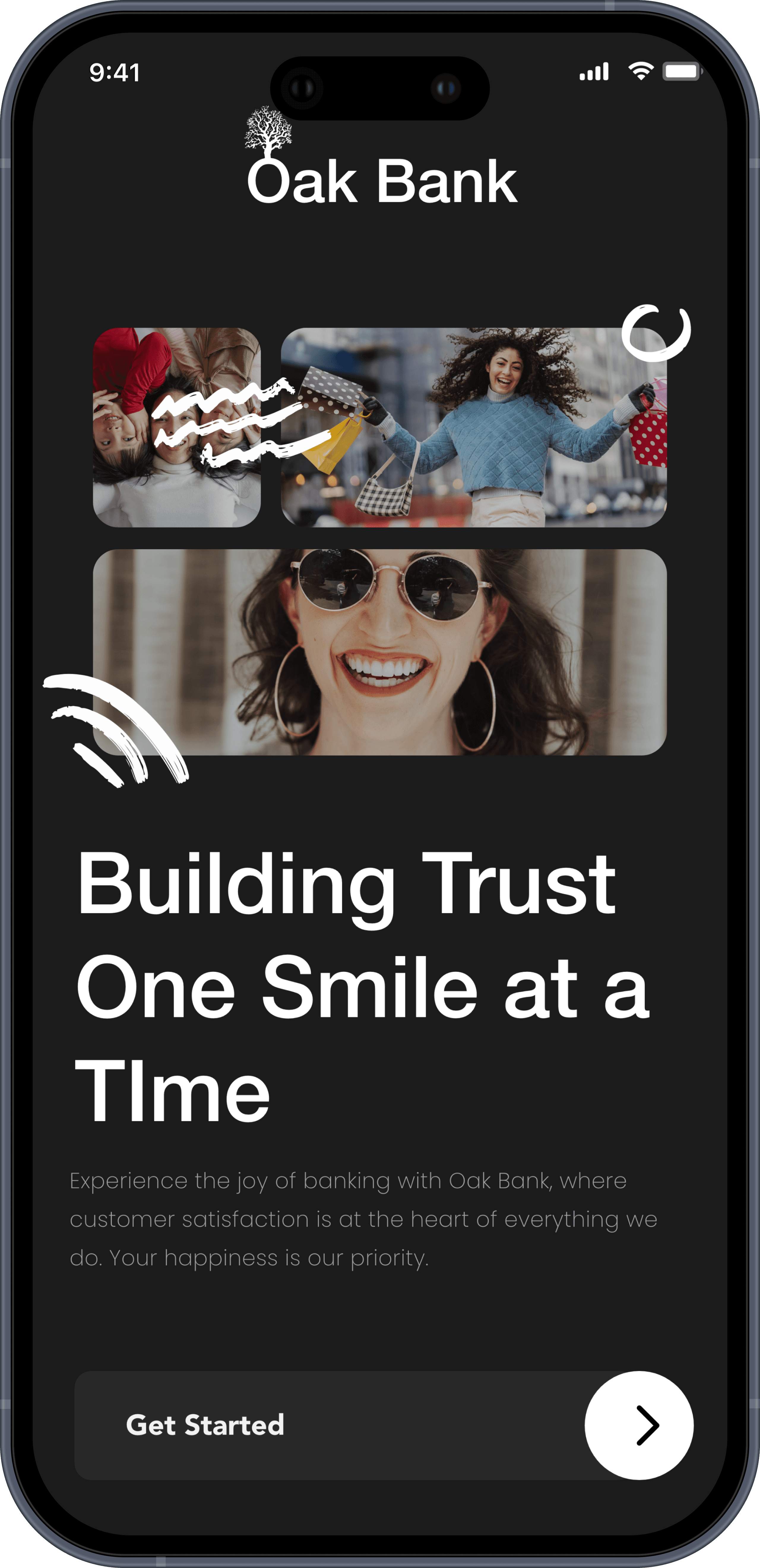
Human imagery builds emotional connection before sign-up is prompted.

Human imagery builds emotional connection before sign-up is prompted.

Onboarding flow

Onboarding flow

The complete Oak Bank experience.

The complete Oak Bank experience.

The complete Oak Bank experience.

Every screen carries the same dark surface, card-based grouping, and typographic hierarchy, creating a consistent system users can navigate with confidence.

Core Banking

Home Dashboard

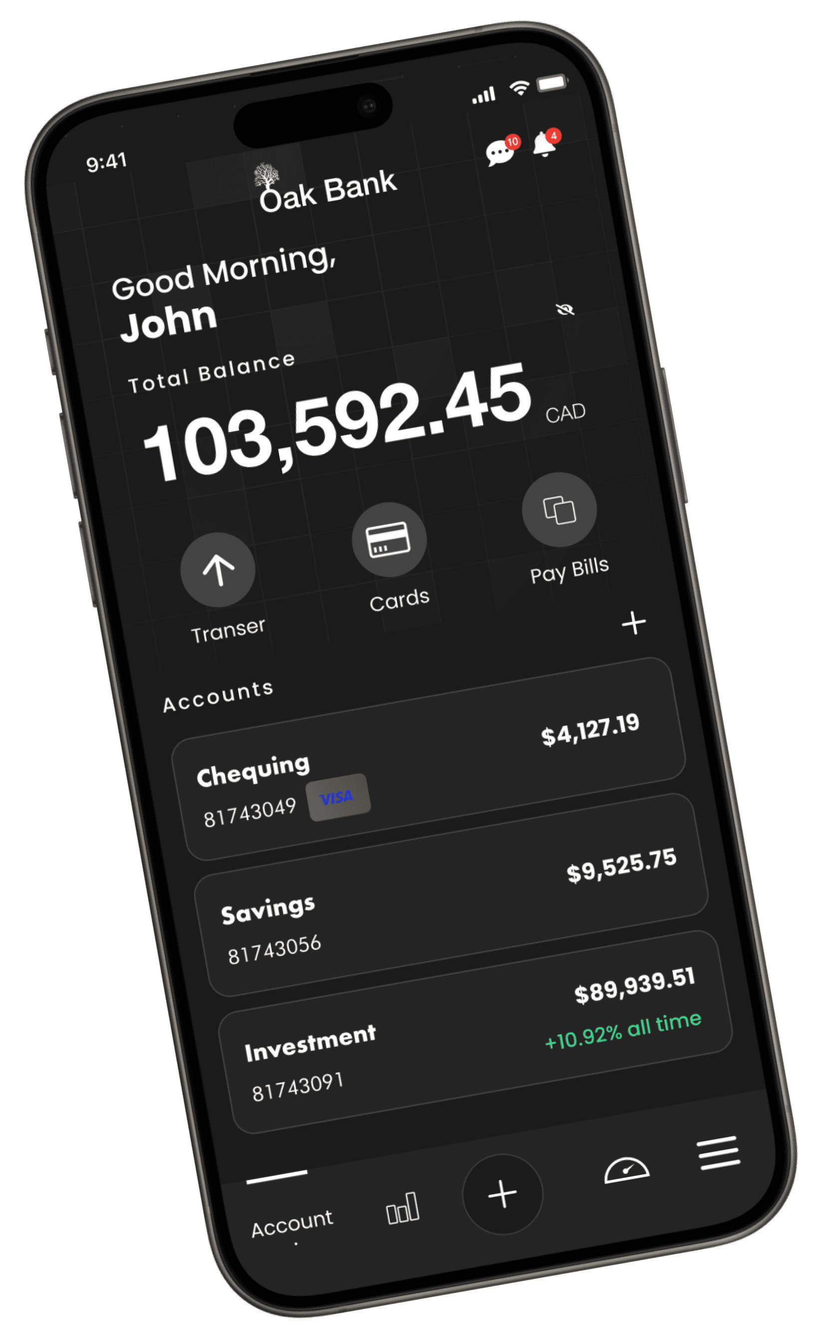
Total balance, all accounts, credit card usage bars, and savings goals visible in one scroll.

Total balance, all accounts, credit card usage bars, and savings goals visible in one scroll.

Insights

Income vs expense bar chart, budgeting tips, and a full colour-coded transaction feed.

Income vs expense bar chart, budgeting tips, and a full colour-coded transaction feed.

Credit Score

Equifax-powered score with a trend history chart and credit factor breakdown, Poor to Excellent.

Savings Goals

Named goals with green progress bars and monthly savings targets, Alberta Trip, Wedding, Mortgage.

Named goals with green progress bars and monthly savings targets, Alberta Trip, Wedding, Mortgage.

Card Management


Cash Card — Transactions

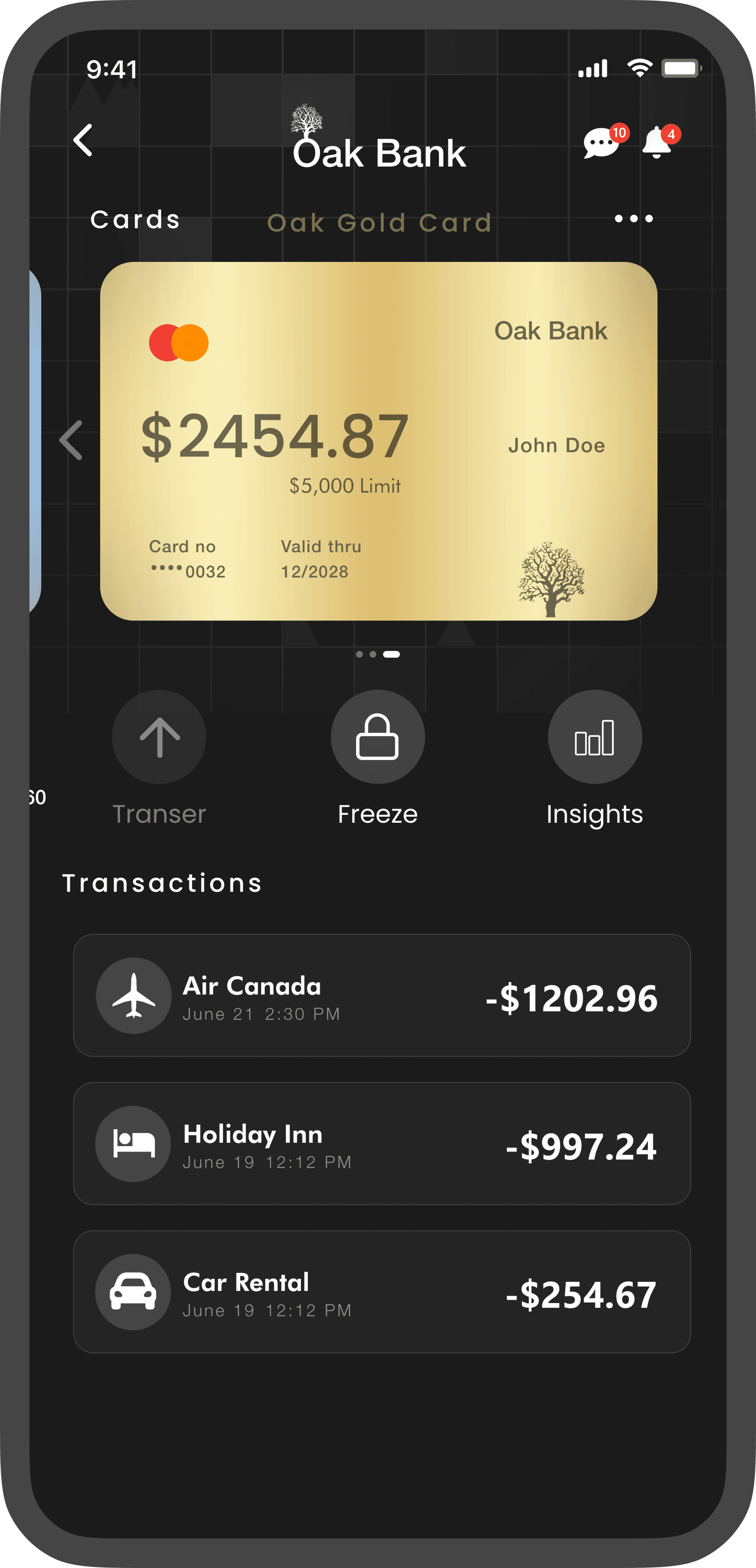
Physical card visual with swipeable transactions, merchant icons, and quick actions.

Physical card visual with swipeable transactions, merchant icons, and quick actions.

Cash Card — Manage

Lock card, mark as lost, request a new card, or add to Apple Wallet, all in one place.

Lock card, mark as lost, request a new card, or add to Apple Wallet, all in one place.

Gold Card — Transactions

Premium gold card view with transaction history and a $5,000 limit usage indicator.

Premium gold card view with transaction history and a $5,000 limit usage indicator.

Gold Card — Manage

Billing cycle, credit bar, and full card management options for the Gold Mastercard.

Billing cycle, credit bar, and full card management options for the Gold Mastercard.

Chequing — Transactions

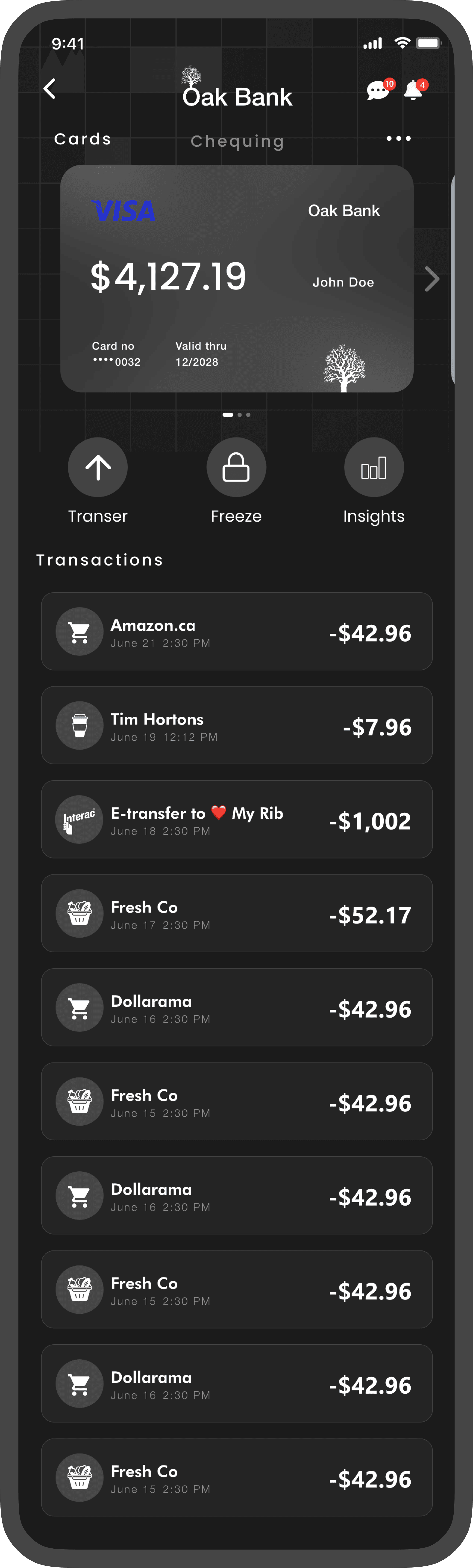
Day-to-day transaction history for the primary chequing account with categorised rows.

Day-to-day transaction history for the primary chequing account with categorised rows.

Chequing — Manage

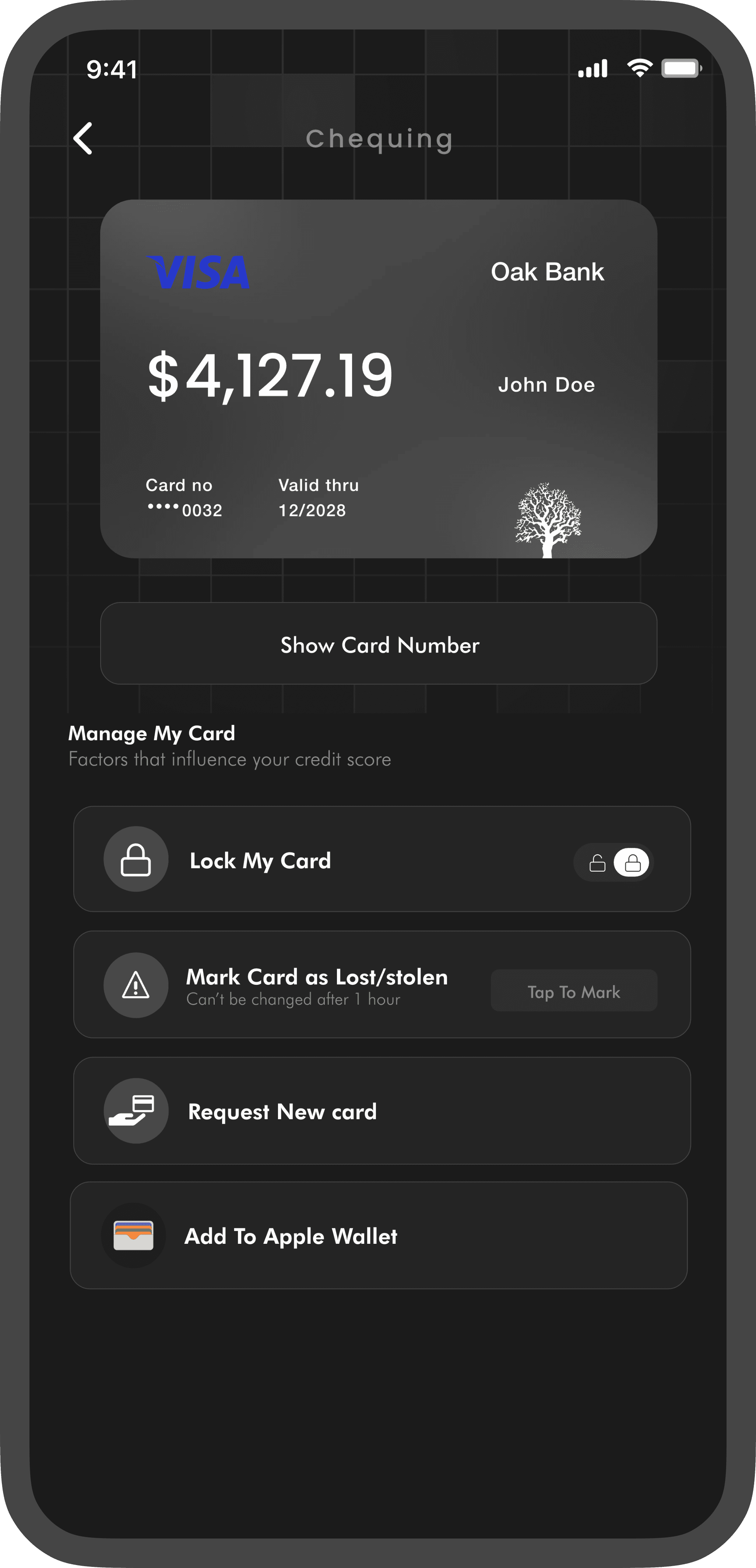
Show card number, lock, mark lost, request replacement, or add to Apple Wallet.

Show card number, lock, mark lost, request replacement, or add to Apple Wallet.

Investments


Stocks Portfolio

Wave chart with time ranges, available funds, and a portfolio of AAPL, TD, MSFT and Tesla.

Wave chart with time ranges, available funds, and a portfolio of AAPL, TD, MSFT and Tesla.

Crypto Portfolio

Bitcoin and Tether holdings with a live performance curve and deposit/withdraw actions.

Bitcoin and Tether holdings with a live performance curve and deposit/withdraw actions.

Transactions, Notifications & Support


Stocks Portfolio

Wave chart with time ranges, available funds, and a portfolio of AAPL, TD, MSFT and Tesla.

Wave chart with time ranges, available funds, and a portfolio of AAPL, TD, MSFT and Tesla.

Crypto Portfolio

Bitcoin and Tether holdings with a live performance curve and deposit/withdraw actions.

Bitcoin and Tether holdings with a live performance curve and deposit/withdraw actions.

Usability Testing & Iteration

Usability Testing & Iteration

From rough sketch

to refined solution.

From rough sketch

to refined solution.

From rough sketch

to refined solution.

Each feedback item shows the full loop, the wireframe that exposed the problem, the user who named it, the decision made, and the final screen that fixed it.

Methodology

👥 5 participants

⏱ 30-min moderated sessions

🗣 Think-aloud protocol

📋 Task-based scenarios

Usability Testing

Feedback 1

The lack of a quick message support button is frustrating. Whenever I

encounter an issue or have a question while using the app, there's no easy

way to reach out for help. Adding a visible message support button would

greatly improve the user experience by providing a direct and efficient

channel to get assistance when needed.

Before

4

After

4

10

Usability Testing

Feedback 2

The absence of a progress bar to indicate credit card usage is frustrating and confusing. It's like navigating in the dark, not knowing how much creditI've used and how close I am to reaching my limit. Having a progress bar would significantly improve the user experience by providing a clear an visual representation of my credit card usage, making it easier to manage my finances.

Before

Oak Cashback Card

81743049

$2,000

Limit

$225.25

Oak Gold Card

$5,000

Limit

81743049

$2454.87

After

Oak Cashback Card

81743049

$2,000

$225.25

12/2028

Valid thru

0032

Card no

Julia Guo

$225.25

$2,000

Limit

Oak Bank

Oak Gold Card

$5,000

81743049

$2454.87

Oak Bank

Julia Guo

12/2028

Valid thru

0032

Card no

$2454.87

$5,000

Limit

Usability Testing

Feedback 3

When reviewing my transaction history, I find it challenging to differentiate
between transactions from different accounts. The current design lacks
clear visual indicators or color-coded labels, making it confusing and time-
consuming to identify which account each transaction belongs to.

Before

-$1202.96

Air Canada

2:30 PM

June 21

-$997.24

Holiday Inn

12:12 PM

June 19

-$254.67

Car Rental

12:12 PM

June 19

After

-$1202.96

Air Canada

2:30 PM

June 21

-$997.24

Holiday Inn

12:12 PM

June 19

-$254.67

Car Rental

12:12 PM

June 19

Usability Testing

Feedback 4

It's frustrating not having a quick overview of my savings on the Home
Screen. Digging deep into the app just to check my savings balance wastes
time and feels like an unnecessary hassle. I'd love to see a simple and clear
display of my savings right on the Home Screen, so I can easily track my
progress without the extra steps.

After

Alberta Trip

December,2023

$2,000

$100

Wedding Anniversary

October,2023

$1,500

$100

App in Action

Bringing pixels to life.

The home screen brings together everything Oak Bank is about — total balance at a glance, credit visibility, savings progress, and investment returns in one coherent view.

Oak Bank

Cultivate your Wealth,

Nurture your Future.

Experience the power of smart banking. Manage your finances seamlessly, take control of your accounts, and embark on a journey toward financial growth.

Dashboard

Your finances,

at a glance.

Total balance, accounts, credit status

and savings goals — all visible the

moment you open the app.

Credit Score

Know your

credit health.

Powered by Equifax. See your score,

track trends, and understand every

factor — all in one place.

Savings Goals

Save with

purpose.

Name your goals, set targets, and watch

your progress grow — Alberta Trip,

Wedding, Mortgage and more.

Invest

Stocks & crypto,

in your pocket.

Apple, Tesla, Bitcoin — manage your full

investment portfolio right alongside your

everyday banking.

Card Management

Your cards,

fully in control.

Freeze, transfer, request a new card or

add to Apple Wallet — every action one

tap away.

Support

Help that

feels human.

A real advisor, a real conversation.

Support that's always one tap away —

not buried in a menu.

Available on

iOS — iPhone & iPad

4.8

· 2.4K Ratings

Finance · #2 in Canada

App Store

Designed for the App Store.

Each screenshot is crafted to communicate a single value proposition —

fast enough for a two-second scroll, detailed enough to convert.