Oak Bank
Cultivate your Wealth, Nuture
your Future.
Case study, Prototyping, Presentation, Mobile design
Industry
Finance
Solo Project
Team
Tools USed
Figma, Adobe XD
“In the world of digital finance, innovation is not an option but a necessity. Oak Bank exemplifies this, redefining mobile banking with cutting-edge features, personalized experiences, and a commitment to trust.”
Background
In an era dominated by digital transformation, Oak Bank emerges as a fictional yet groundbreaking project, pushing the boundaries of what's possible in mobile banking. This case study delves into the key aspects that make Oak Bank a pioneer in the realm of digital finance.
The Oak Bank mobile app transforms traditional banking into a dynamic and personalized experience. Users can effortlessly manage their accounts, conduct secure transactions, and explore diverse investment avenues, including the exciting world of cryptocurrencies.
Problem
What are some of the key problems we want to solve?
Understanding the obstacles that users face in traditional banking and digital finance, Oak Bank recognizes some of the following problems:
-
Users struggle with the complexity of traditional banking interfaces, making it challenging to manage accounts efficiently.
-
Users find themselves constrained by the limited investment opportunities offered by conventional banking platforms.
-
Many users feel overlooked by traditional banks, which offer a one-size-fits-all approach, neglecting the need for personalized financial experiences.
-
Users face frustration with outdated customer support systems that are slow to respond and often lack the personalized assistance required.
-
While aiming for responsiveness, there is a risk of inconsistent customer support quality, leading to varying experiences for users depending on the nature and urgency of their queries.
-
Users express concerns about the vulnerability of their financial data and transactions due to inadequate security measures in traditional banking platforms, creating a need for a more secure and trustworthy environment.
Usability
Testing
What are we trying to achieve?
In our pursuit of delivering an optimal user experience, we conducted usability testing to gather valuable insights. This section presents key feedback from users, shedding light on aspects that contribute to the usability and user satisfaction of our platform.
Feedback 1
The absence of a quick message support button is frustrating. Without an easy way to seek assistance within the app, it leaves users feeling unsupported. Adding a visible message support button would significantly enhance the user experience, providing a direct and efficient channel for assistance.
Before


After
Feedback 2
The absence of a credit card usage progress bar is both frustrating and perplexing, leaving users in the dark about their credit status. Implementing a progress bar would significantly elevate the user experience, providing a clear and visual representation to facilitate more effective financial management.
Result
Feedback 3
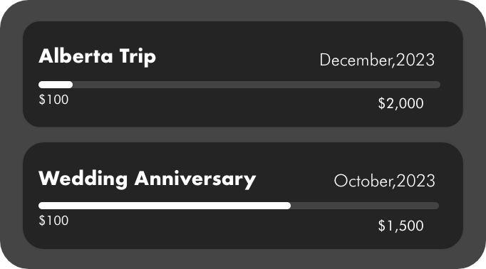
Not having a quick overview of my savings on the Home Screen is frustrating and time-consuming. A simple display of my savings on the Home Screen would streamline the process, allowing me to easily track my progress without unnecessary steps.

After
Before

Feedback 4
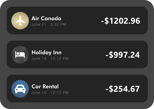
Reviewing my transaction history is challenging due to a lack of clear visual indicators or color-coded labels to differentiate between transactions from different accounts. The current design is confusing and time-consuming in identifying each transaction's associated account.
After

Before
Competitive Research

RBC employs a bottom navigation pattern and employs visually appealing card-style layouts, ensuring easy access to critical sections like account summaries and transaction histories. While the app follows a minimalist approach, emphasizing essential features and robust security, there is room for improvement in terms of accessibility features such as scalable fonts and voice-over compatibility.
RBC's mobile app places a strong emphasis on user-friendly design, with a focus on clear visibility and interactive elements on the home screen. The app maintains a consistent layout and logical organization to enhance the overall user experience.
Royal Bank


Despite its emphasis on essential features, robust authentication, and comprehensive user assistance, Scotia Bank's mobile app faces some shortcomings. The absence of key accessibility features, such as font size adjustment and voice-over compatibility, raises concerns about inclusivity. Additionally, challenges in understanding credit card usage information and limits point to areas where the app could benefit from improvements in user clarity and comprehension.
Scotia Bank's mobile app, characterized by its vibrant red and white brand identity, offers users a visually engaging interface with clear navigation and interactive elements. The app, featuring a bottom navigation pattern and card-style layouts, prioritizes visibility for account summaries and transactions.
Scotia Bank

Solution
-
Oak Bank develops a user-friendly interface for streamlined and intuitive account management, simplifying the user experience.
-
Oak Bank introduces a diverse range of investment opportunities, including cryptocurrencies, broadening users' choices for their financial growth.
-
Oak Bank designs intuitive investment tools, catering to users with varying levels of financial expertise, making the investment process accessible and straightforward.
-
A dedicated and responsive customer support system is implemented to address user queries promptly, fostering a sense of reliability and assistance.
-
A dedicated and responsive customer support system is implemented to address user queries promptly, fostering a sense of reliability and assistance.
To address the identified problems and elevate the user experience in digital finance, Oak Bank proposes the following solutions:
What are some of the possible solutions ?


User Persona
To better understand our users…
Problems
Emily Anderson-Smith struggles with managing her finances efficiently due to her hectic schedule. Traditional banking feels cumbersome, and she seeks a solution that aligns with her tech-savvy lifestyle.
Emily Anderson-Smith needs a mobile banking solution that offers seamless account management, quick money transfers, and advanced investment options. Personalized financial goal tracking is crucial for her to stay on top of her financial objectives amidst her busy schedule.
Needs
Emily Anderson-Smith

30
Software Developer
By addressing the needs of Emily Anderson-Smith and Alex Rodriguez-Miller, Oak Bank is positioned to cater to the unique requirements of both personas, creating a comprehensive and user-centric financial experience.
Typography
ABCDEFGHIJKLMNOPQRSTUVWXYZ
0123456789
abcdefghijklmnopqrstuvwxyz
Poppins
Regular
Medium
Semi Bold
Bold
ABCDEFGHIJKLMNOPQRSTUVWXYZ
0123456789
abcdefghijklmnopqrstuvwxyz
Helvetic Neue
Light
App in Action

Color Palette
Secondary Color
446F9A
EDE0AA
3AC884
C8574A
Primary Color
202020
ECEAEA
6F6E6E
Mobile Screen
Splash Screen

Navigation Bar


Onbaording

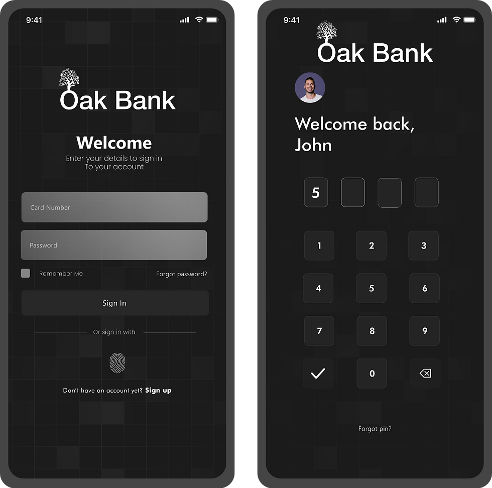
Login Process
Home Screen

Credit Score Screen

Insights Screen

More/Settings Screen

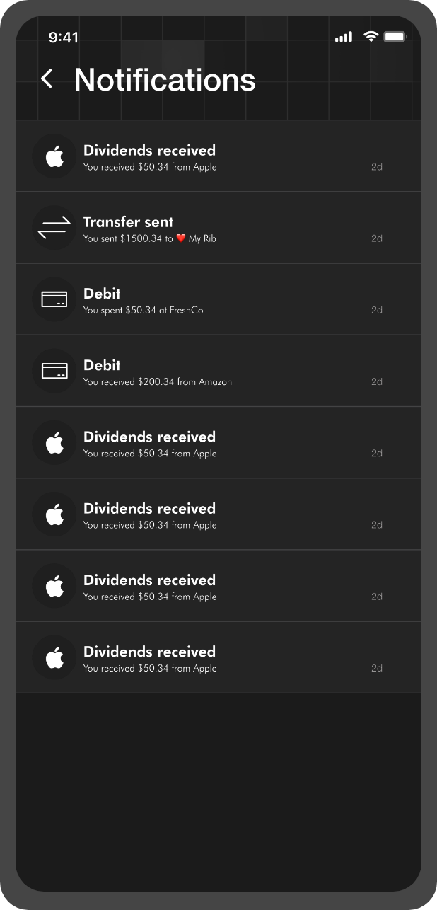
Notification Screen
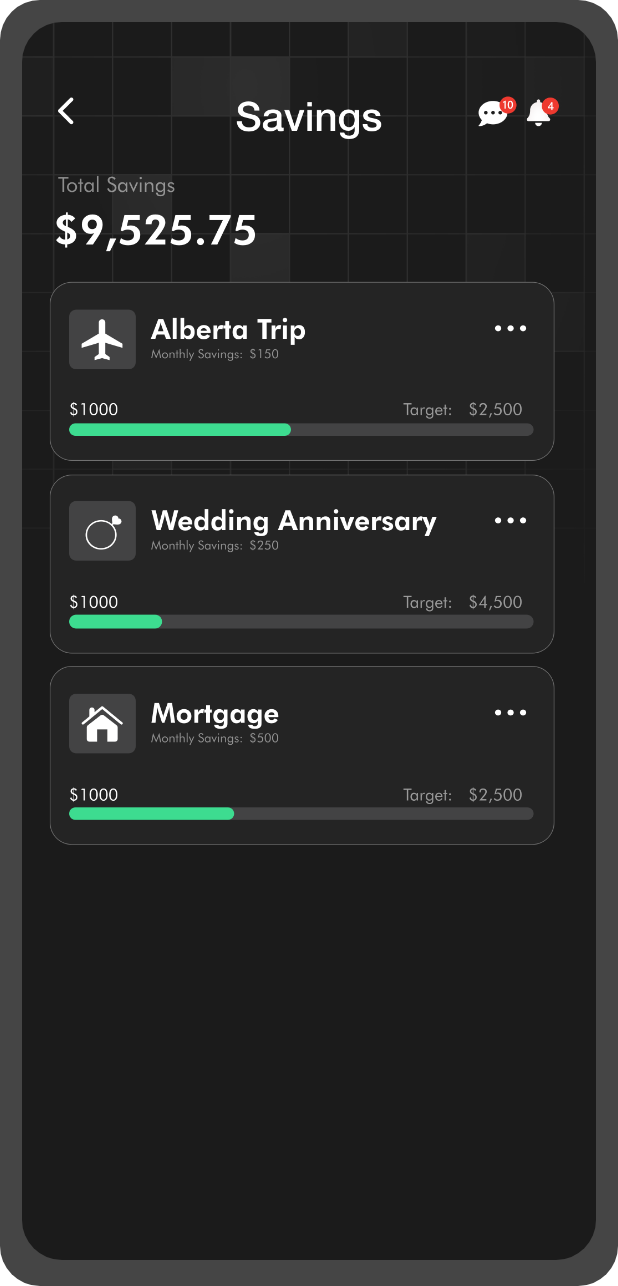
Savings Screen
Support Screens

Card Screen

Splash Screen


Transfer Screen

