GRT mobile experience redesign
Role: UX/UI Designer
Type: Concept Redesign
Tools: Figma, FigJam
Timeline: 8 Weeks


Project Snapshot
Outcome
Design Process
A focused process built around real rider friction.
Instead of jumping straight to polished UI, the project started with understanding the highest-friction rider tasks, then translating those findings into cleaner flows and more confident interface decisions.
01
Problem Discovery
Reviewed the existing website and identified the most broken moments across mobile use cases.
02
Research
Defined key user questions, rider types, and high friction actions tied to schedule and card management.
03
Design Exploration
Mapped clearer task flows and redesigned pages using a lighter, more modern hierarchy.
04
Prototype
Created polished mobile and
web visuals for a portfolio-
ready concept case study presentation.
Design Goals
What the redesign
needed to
achieve.
Surface real-time transit information immediately.
Reduce the number of steps for card management.
Create a cleaner mobile-first experience with clearer hierarchy.
Build a consistent UI system across mobile and web touchpoints.
Design Principles
Simple rules that guided every
screen.
01
Clarity first
Prioritize real-time information and critical rider actions above
everything else.
02
Reduce friction
Shorten common flows and make primary actions obvious at a
glance.
03
Consistent system
Use repeatable patterns so both web and mobile experiences feel
connected.
Research
Questions, assumptions, and what the project uncovered.
Heuristic review
Audience assumptions
UX audit
Interface analysis
Research Questions
How quickly can riders find schedule information on mobile?
Where do users expect to check card balance and manage their card?
Which actions should be promoted directly on the dashboard?
How can the web experience better support mobile-first rider behavior?
Target Audience
Daily commuters, students, and occasional transit users who need fast,
confidence-building access to route schedules, balances, and card actions
while on the move.
92%
of riders checked schedules on
mobile first.
95%
struggled to locate their transit
card balance.
72%
wanted quick actions directly
from the home screen.
27%
still relied on the desktop layout
for critical tasks.
Rider Types
Lean personas based on the clearest use cases.
Daily commuter + occasional rider scenarios

Occasional rider
Jason Patel
Age 34
Sarah Johnson
Daily commuter • Age 28
INTROVERT
TECH SAVY
CAREFUL
DETERMINED
"I just want to check my next bus and know how much is left on my card without digging around."
Core Needs
•
Check arrival
times quickly
•
Track balance
before
boarding
•
Manage transit
card in fewer
taps
Frustrations
•
Hidden
balance
information
•
Slow task
completion
•
Desktop-like
mobile layout

Occasional rider
Jason Patel
Age 34
Jason Patel
Occasional rider • Age 34
OBSERVANT
PRACTICAL
INDEPENDENT
CURIOUS
"When I use transit, I need the experience to feel obvious right away or I lose confidence fast."
Core Needs
•
Find routes easily
•
Top up without
confusion
•
Understand
the interface
instantly
Frustrations
•
Complex
navigation
•
Too many
menus
•
Weak visual
hierarchy
Task Flow
Simplifying one of the most important rider actions.
The add-card experience was redesigned to feel obvious and
direct. Instead of burying the task, the new flow leads users
from a focused dashboard into a short, easy-to-scan
sequence.
1
Home
2
Wallet
3
Add
Transit
Card
4
Enter Card
Number
5
Confirm
Mobile App
A lighter mobile experience built around quick confidence.
The mobile concept focuses on giving riders the most useful information first: visible card balance, schedule
access, and cleaner entry points into common tasks.
Dashboard
Key routes, balance, and actions in one place.
Tickets & Passes
Clear, flexible fare options from single rides to seasonal passes.
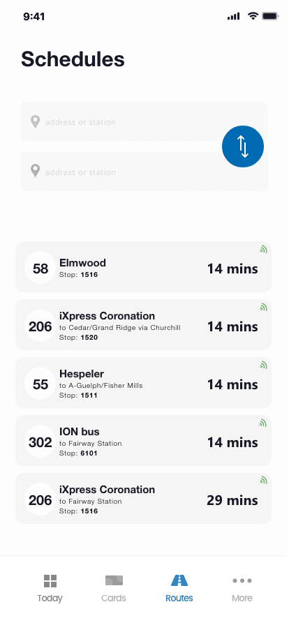
Schedules
Fast access to routes and live arrival
information.
Redesigned Web UI
Before and after visuals presented in a cleaner portfolio style.
Screen 1
Home / Dashboard
Before
Scattered information, weak
hierarchy, important actions
hidden.
After
A cleaner dashboard that surfaces
routes, balance, and quick actions
immediately.


Screen 2
Login
Before
The task felt buried and form
layout added unnecessary friction.
After
The redesigned form highlights the
essential action and reduces the
cognitive load.


Screen 3
Add Card
Before
Controls were hard to scan and
card actions were visually
disconnected.
After
Cards, balances, and actions are
grouped into a cleaner, more
manageable system.


Screen 4
Manage Cards
Before
Low visual emphasis and unclear
structure for account access.
After
A simplified sign-in flow with
stronger hierarchy and improved
readability.


Results
Clearer outcomes framed
as portfolio-ready impact.
6→2
steps to manage transit cards
3x
faster access
to schedule
information
+Trust
through
clearer
hierarchy and
better
visibility
What I Learned
Designing transit products
means designing for speed and
reassurance.
Clarity compounds
Small simplifications across schedules, balances, and forms created a much
more confident rider experience overall.
Accessibility builds trust
Better contrast, spacing, and hierarchy made the interface easier to scan in
fast-moving transit contexts.
Design systems speed delivery
Creating a reusable visual language made each follow-up screen faster to
build and easier to keep consistent.
Next
Ready to work together?
I design digital experiences that balance clarity, structure, and visual confidence from case studies to full product concepts.
Contact Me
View More Projects